Revamping IGH Landing Page

Revamping IGH Landing Page

Greenlife Harvest

Web Design

Q3 2024

Aug 22, 2024

TL;DR

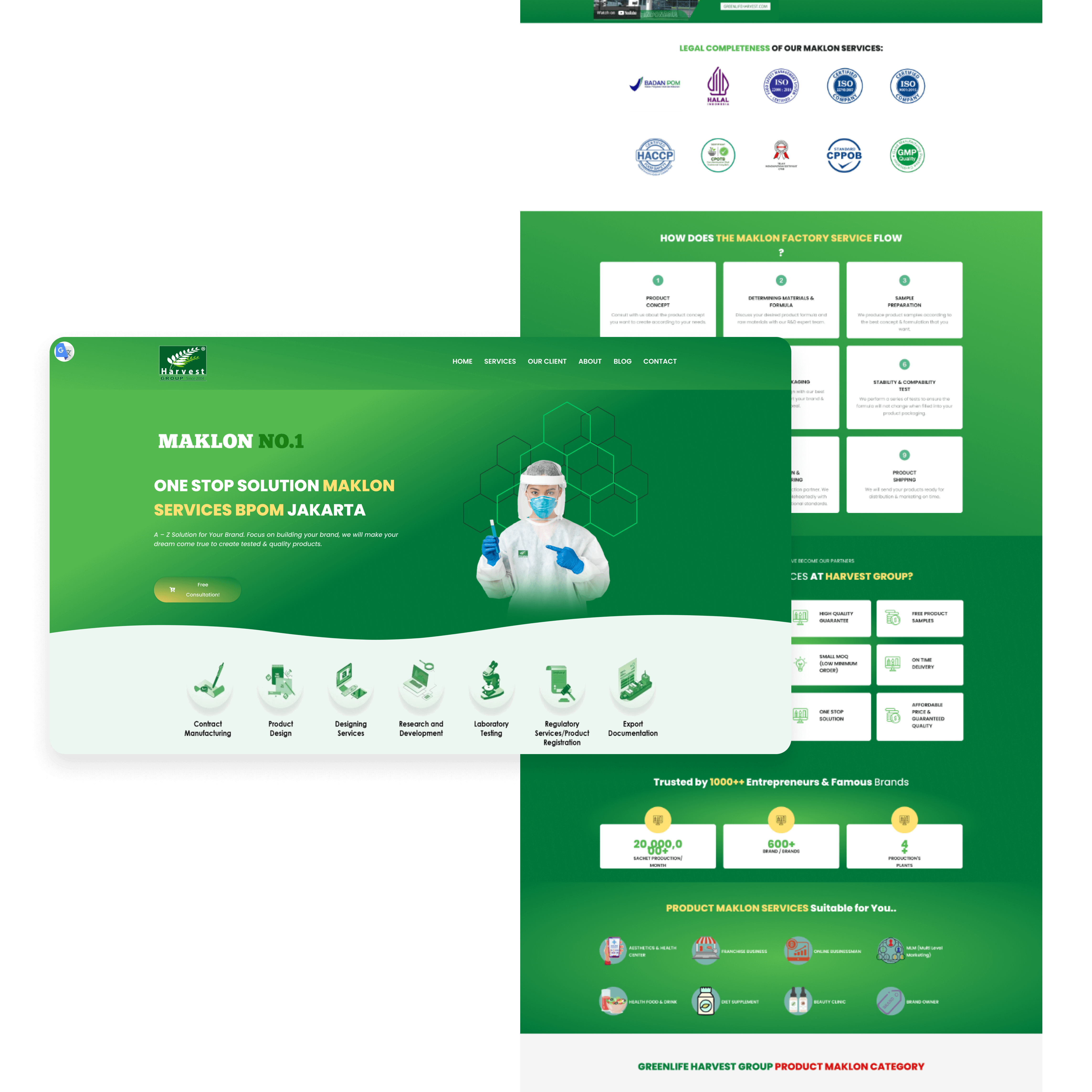
We moved back and forth with our design decision, but our pillars stayed the same, making them at the top of mind of the maklon manufacturing industry. We found several key points to improve their landing page. We first put their key metrics (e.g. BPOM certified product) on the hero section to bring trust and credibility at first glance. We agreed by making their facility as the key visual would bring trust to their potential client. We also highlight their services, making them flexible when it comes to toll manufacturing.

[Visit Website]

Intro

In August 2024, our business development team shared exciting news—we had secured a new lead! The client asked us to develop an ERP system for their toll manufacturing company (the Indonesian term is “maklon” or “makloon,” but I’ll use “toll” for consistency). As part of the package, we were also tasked with revamping their website. My goal was not just to increase traffic, but also to give their site a fresher, more modern look.
Three Body Problems

  • Information overload: The homepage tried to showcase too much at once, overwhelming visitors.

  • Cluttered content: As a result, the site was hard to scan, and important messages were lost.

  • Missing key metrics: There was little emphasis on their credentials and achievements— a missed opportunity to win client trust early.

Three Body Problems

  • Information overload: The homepage tried to showcase too much at once, overwhelming visitors.

  • Cluttered content: As a result, the site was hard to scan, and important messages were lost.

  • Missing key metrics: There was little emphasis on their credentials and achievements— a missed opportunity to win client trust early.

Three Body Problems

  • Information overload: The homepage tried to showcase too much at once, overwhelming visitors.

  • Cluttered content: As a result, the site was hard to scan, and important messages were lost.

  • Missing key metrics: There was little emphasis on their credentials and achievements— a missed opportunity to win client trust early.

Objective

  • Revamp the content hierarchy for a stronger narrative flow.

  • Simplify the design to reduce cognitive load and make information easier to digest.

  • Highlight core metrics and credentials to differentiate the business and build credibility.

Objective

  • Revamp the content hierarchy for a stronger narrative flow.

  • Simplify the design to reduce cognitive load and make information easier to digest.

  • Highlight core metrics and credentials to differentiate the business and build credibility.

Objective

  • Revamp the content hierarchy for a stronger narrative flow.

  • Simplify the design to reduce cognitive load and make information easier to digest.

  • Highlight core metrics and credentials to differentiate the business and build credibility.

Initial Attempt

My first attempt centered on using their product as the main visual, aiming to illustrate their flexibility as a toll manufacturer. Using Spline, I created a 3D “your brand” placeholder and moved key metrics like SKUs to the hero section for instant credibility. I also reorganized sections like the manufacturing process and “Why Us” to drive a clear, persuasive message.

However, after presenting this approach, the client preferred a different design direction. Embracing their feedback, I developed two new versions:

  • Editorial Style: This version showcased product visuals, emphasizing the types of products clients could develop. The narrative was “What you envision, we create.”

  • Corporate Style: Here, we used human photography and work process imagery, fostering trust and highlighting IGH’s professionalism and reliable facilities. The narrative was to make their potential client a transparency on what IGH does inside their plant.

We presented both versions, and the client selected the corporate style. We shared the same vision that their client would feel welcomed by giving a photo of what it looks like inside their plant. I proceeded to redesign the remaining pages to match this direction.

Reflection

This was the first time I truly challenged myself to go beyond my comfort zone. Had the client approved my initial design, I might have settled, missing the chance to broaden my design references and skills. By pushing through and exploring new directions, I grew as a designer—and I’m grateful for that growth throughout this project.

[Click Here to see the website]

Reflection

This was the first time I truly challenged myself to go beyond my comfort zone. Had the client approved my initial design, I might have settled, missing the chance to broaden my design references and skills. By pushing through and exploring new directions, I grew as a designer—and I’m grateful for that growth throughout this project.

[Click Here to see the website]

Reflection

This was the first time I truly challenged myself to go beyond my comfort zone. Had the client approved my initial design, I might have settled, missing the chance to broaden my design references and skills. By pushing through and exploring new directions, I grew as a designer—and I’m grateful for that growth throughout this project.

[Click Here to see the website]

What I have Build and Design

This is where I don't have any constraint from stakeholder and just design for the sake of it.

Create a free website with Framer, the website builder loved by startups, designers and agencies.