Part Of
Mindstores
Alfamart on Mandiri Livin' Sukha
Product Design
Q2 2024
Apr 12, 2024
TL;DR
As part of the Mindstores designer, I was given the task of creating a unique section for the B2B Commerce platform. The section serves as a differentiator between sections and is used for marketing campaigns. August 2025, we pulled our biggest sales due to our marketing campaign. The unique section was one of the channels we used to promote the campaign with approximately 200% surge than our previous campaign. I'm not only designing the section, but also doing the visual work for the campaign. Therefore you can also see my design growth.
Early Days
This journey began in Q2 2024, it was my early days at Mindstores and I was an intern as UI/UX Designer. I was given a task to create a unique section for Mindstores' B2B Commerce. I was entrusted by our product team at Mindstores to create a fresh approach for their marketing campaign section. This is a moment when I realized how design could directly impact business outcomes.
What We Found
So given my limited information about designing a marketing section, I delved upon many similar platforms to benchmark their promotional section.
After gathering multiple relevant platforms, I began dissecting their section and UI patterns. Here's what I found:
They use these patterns, the only difference is their design style. It is a marketing playbook. After these findings, I began designing an early concept of the section.
Designing the Structure: Safe Zone vs. Danger Zone

I first detached (bear with me lolz) a product section interface from the page. Then I use the product card as a measurement to measure the safe area for the key visual.
One technical highlight was establishing clear boundaries for imagery and information within the section:
Key Visual Safe Zone (148 x 289px): Reserved for campaign visuals to ensure clarity and impact, free from clutter and distraction.
Product List Danger Zone (215 x 258px): Dedicated to product displays and promotional details, meticulously dimensioned to avoid information overload.
Padding & Pixel Precision: Micro-margins (16px) guaranteed a clean UI and seamless developer handoff.
Dimensioning: The structure’s foundation was built in 1,3:1 aspect ratio (close to 4:3 AR) for supporting scalability and consistency across future campaigns.

Early Work
After we decide to move with this section, we work on the visual details. At first, we didn't have any campaigns yet, so we used the unique section as a, you guessed it, unique-thematic section. We put noodles in the section and had a bowl of ramen as the focal point. Not my best work, as it was my first work to design a key visual. Notable insights for this design are:
didn't have enough supporting elements, makes it less pronounced as a "unique section"
the redundancy of having a text in the key visual that has the same/similar text as the title section.


A Year Later
Ever since, I have produced more than 40 unique sections across Mindstores' B2B Commerce. Here are some of my previous designs.
These last two campaigns were made using a Pasar Kaget theme with a bold colour and dangdut vibes in mind. The left phone was our visual work for this campaign. The campaign used a vector-based cartoon style. This design was the pilot of the grand theme of Pasar Kaget.
Now this is fun. The right phone was our recent campaign held in August. We still brought the Pasar Kaget theme, but changed the design style to be more 3d-styled cartoon. This campaign hit a major 200% surge than the previous campaign. This result, of course, not only because of the unique section, but also our marketing team that worked their butt off for this campaign. I simply take my part for this moment.


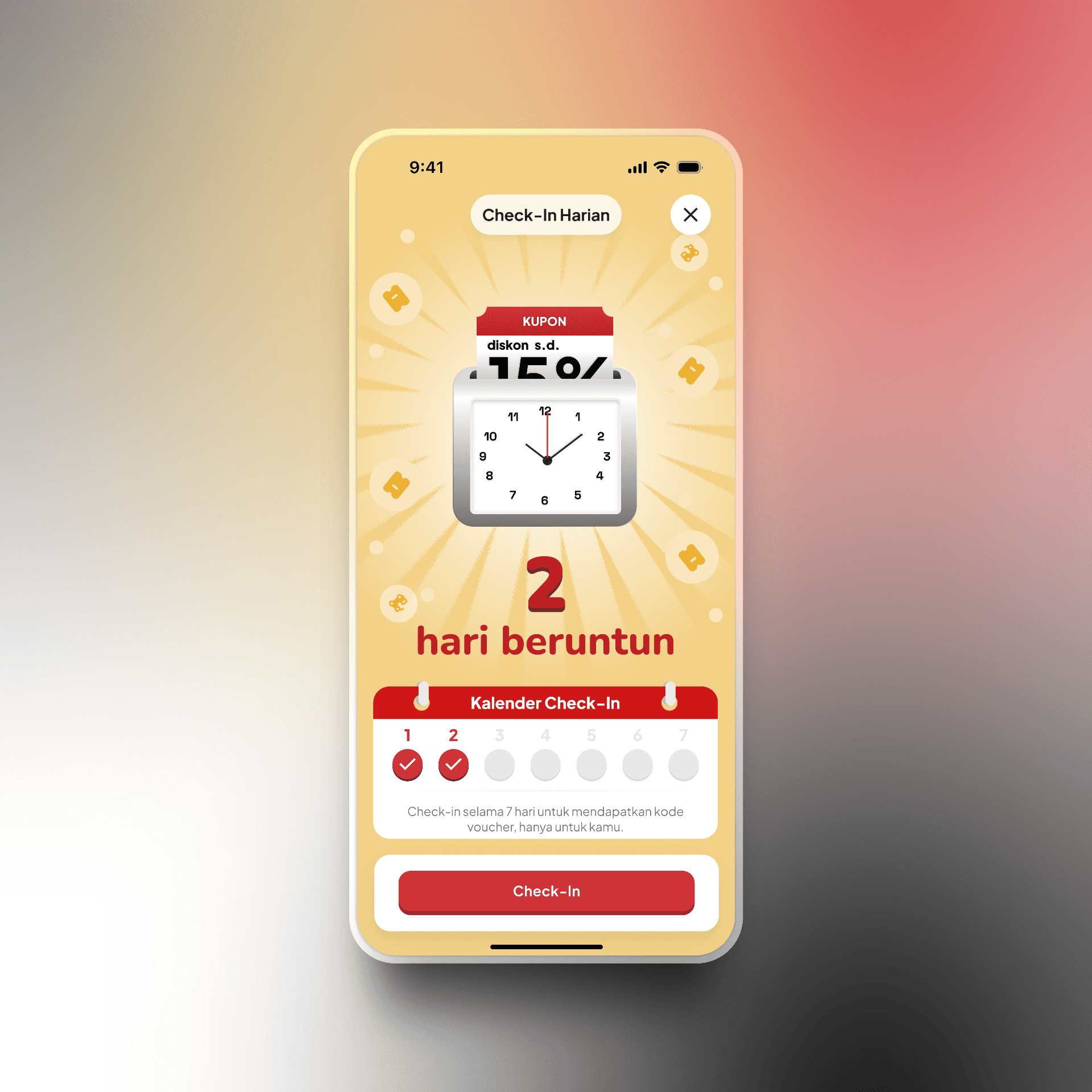


What I have Build and Design
This is where I don't have any constraint from stakeholder and just design for the sake of it.


