Part Of
Mindstores
Alfamind
Product Design
Q1 2025
Mar 15, 2025
TL;DR
Alfamind’s recent update brings grocery to their platform, but the integration between brick-and-mortar store and online grocery need a clever work to outsmart our technical compromises.

Introduction
The story starts in a small meeting room with a yearly recap agenda for Alfamind. My Head of Product (HoP) and I started talking about the possibility of integrating groceries within the App. My HoP already talked with the Alfa’s execs and they greenlit the idea.
But why exactly, tho?

Ever since Alfamind embedded Alfamart, allowing users to shop for their products, the grocery category covered the majority of the revenue stream. This means, the grocery itself outperformed Alfamind’s main category. Because of this, Alfa’s execs want to unleash the potential by expanding the grocery stream with their offline channels. The grand idea is to integrate all of Alfa's staple & grocery chains, starting with Alfamidi as our initial version.
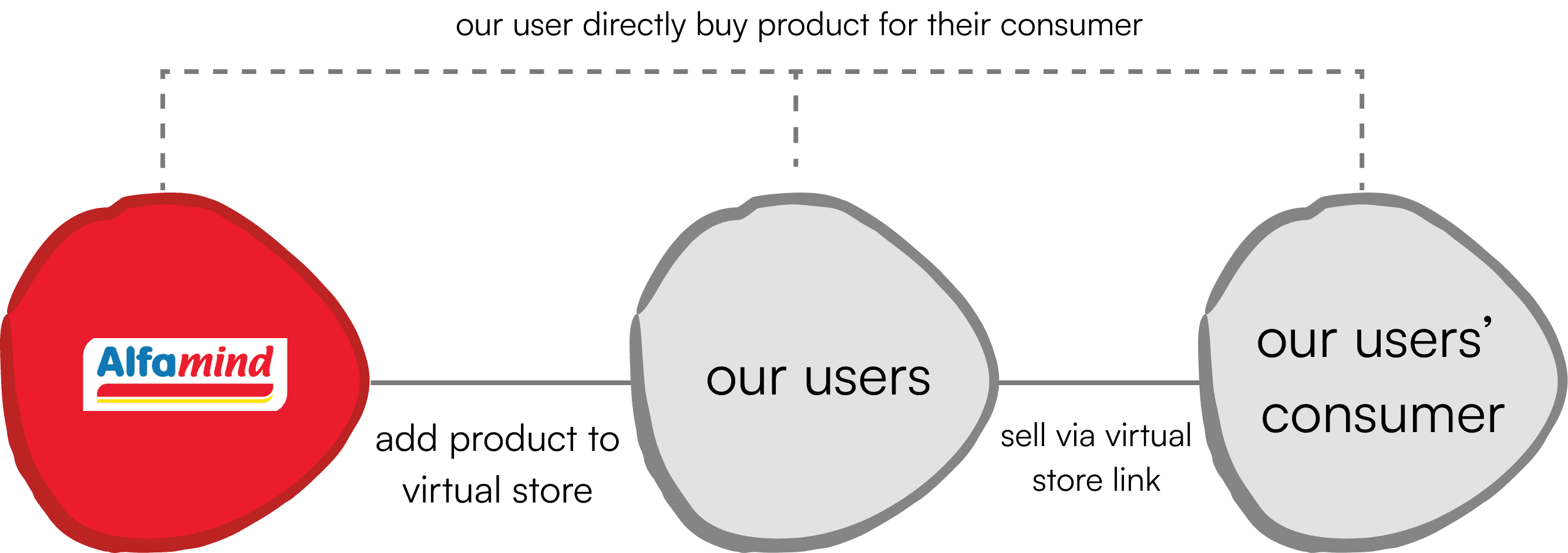
If you don’t know, Alfamind is a social commerce app that helps users to sell products by having their own virtual stores within the app (think of it like affiliate marketers on other platforms). Having a community-based product, the app largely focuses on users from tier 2 and 3 regions. So, having a “guyub” characteristic is one thing we put in mind.
We also took our prior knowledge from B2B Commerce into consideration when building this grocery feature. We knew that grocery products need replenishment everyday and the quantity is very much differ from one store to another, giving an uncertainty on stock availability. In terms of stores, Alfamidi has fewer stores compared to Alfamart, mainly in Java. This would be a problem if our users came from outside of Java (e.g. Bali doesn’t have any Alfamidi stores).
Early Concept

We initially refer to our general idea, by allowing users to buy Alfa’s grocery products through our app. They open our app, find products, and checkout. We mostly refered to a grocery app’s flow so the user will feel less alien. It was really that simple. But was it?
We put two entry points from the homepage for the feature–a dedicated category for grocery and a store section. The entry points will lead the user to a storefront page–designed to be flexible that can be used across different grocery chains.
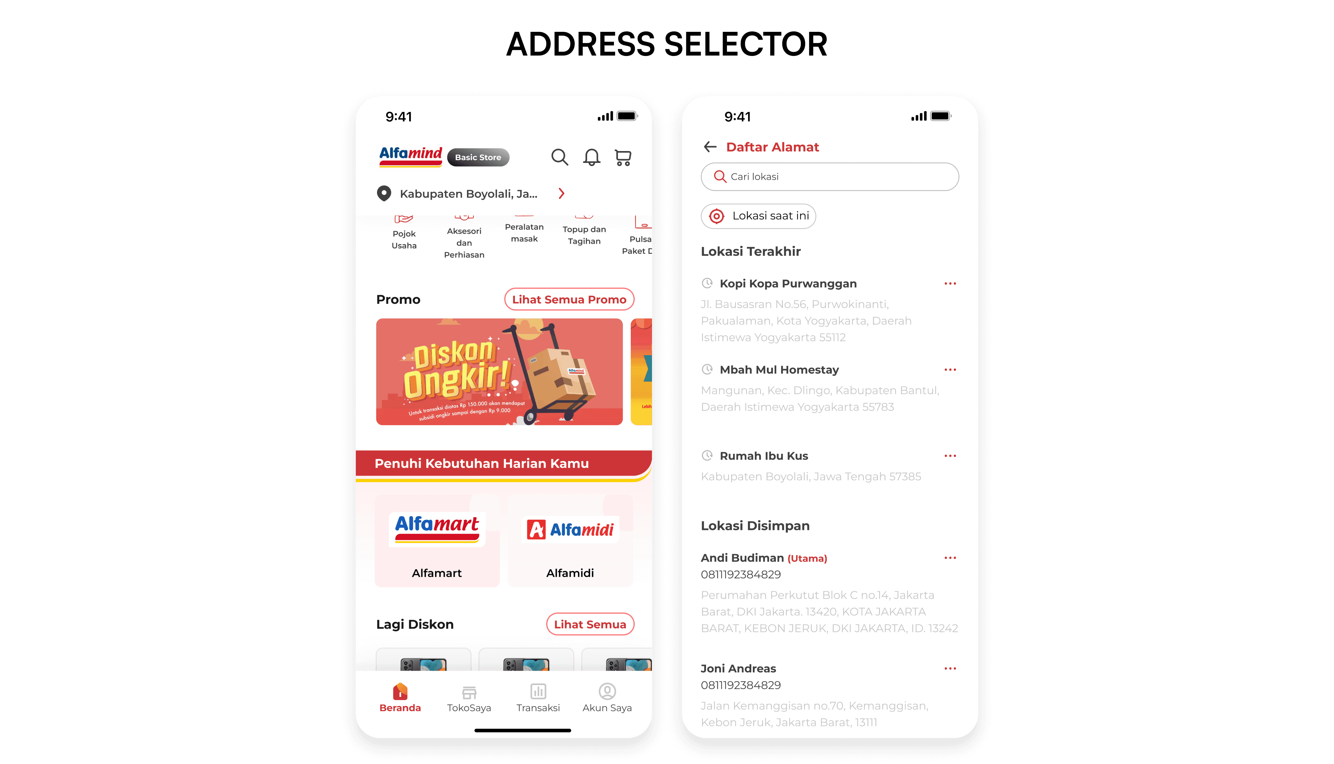
We put an address selector on the home page. We thought by adding this on the front would give users a full control to select different address—same principle that applied by other commerce platform.
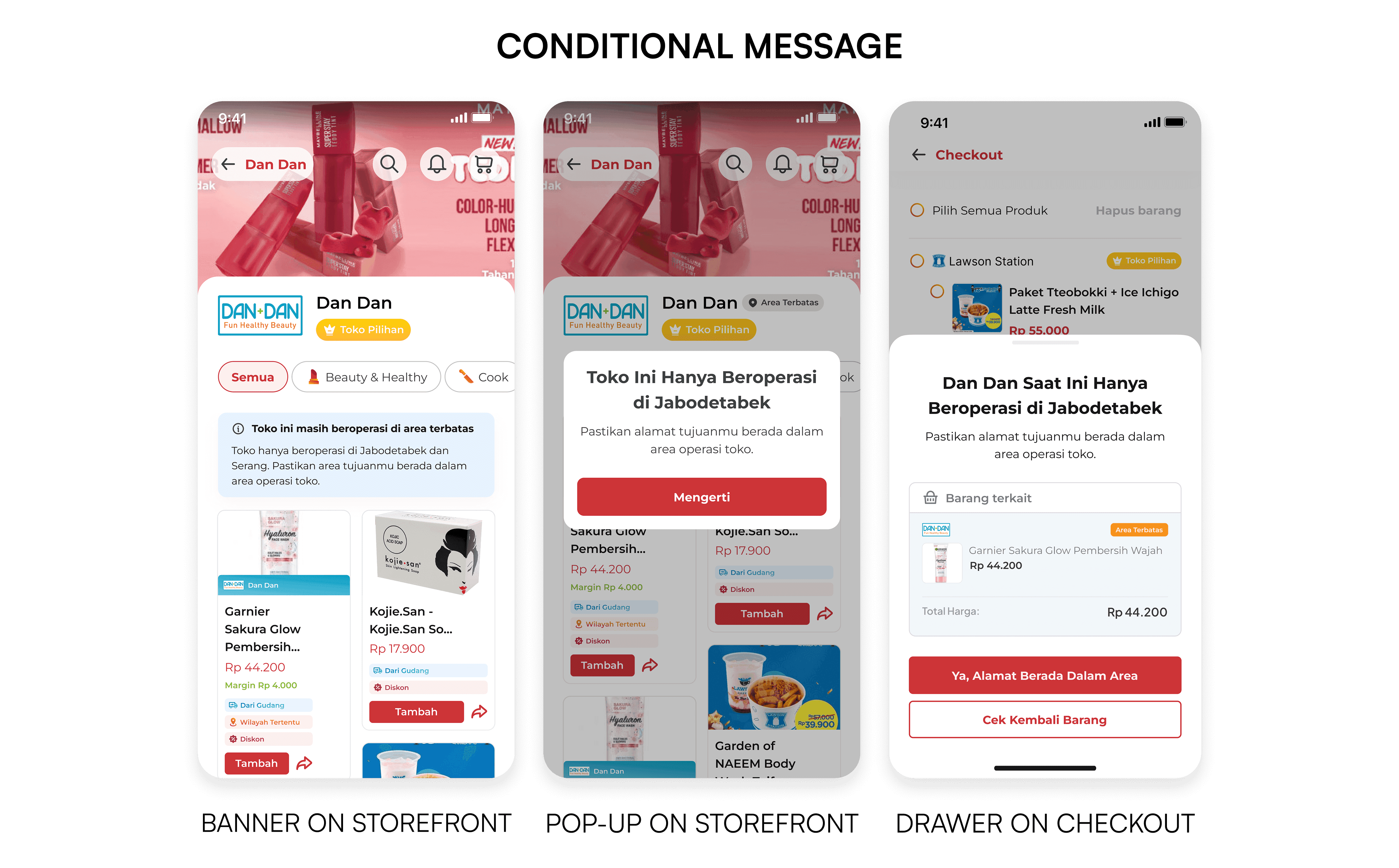
We also explored how conditional message should appear. We thought that apart from Alfamart, there are few to little amount of stores located outside of Java for the rest of the chains, so having an error message would be necessary if we scale up.
We presented the idea, we gave them two alternatives: address on the front & address on the storefront. They didn't like the idea of the former, so we moved with the latter. At the end of the meetings, one of the execs raised some questions:
Final Design

After the meeting, I took a step back to reflect on what I have designed. If we include all grocery products combined with our main products, it will create chaos if we scale up to include the rest of the grocery chains. Not only that, we cannot verify their stock availability if we cannot locate the store in the first place. Bear in mind that the majority of our users often used to buy the product for someone else, so they might have multiple addresses in different places. Surrounded by these thoughts, I was going back to (almost) square one.
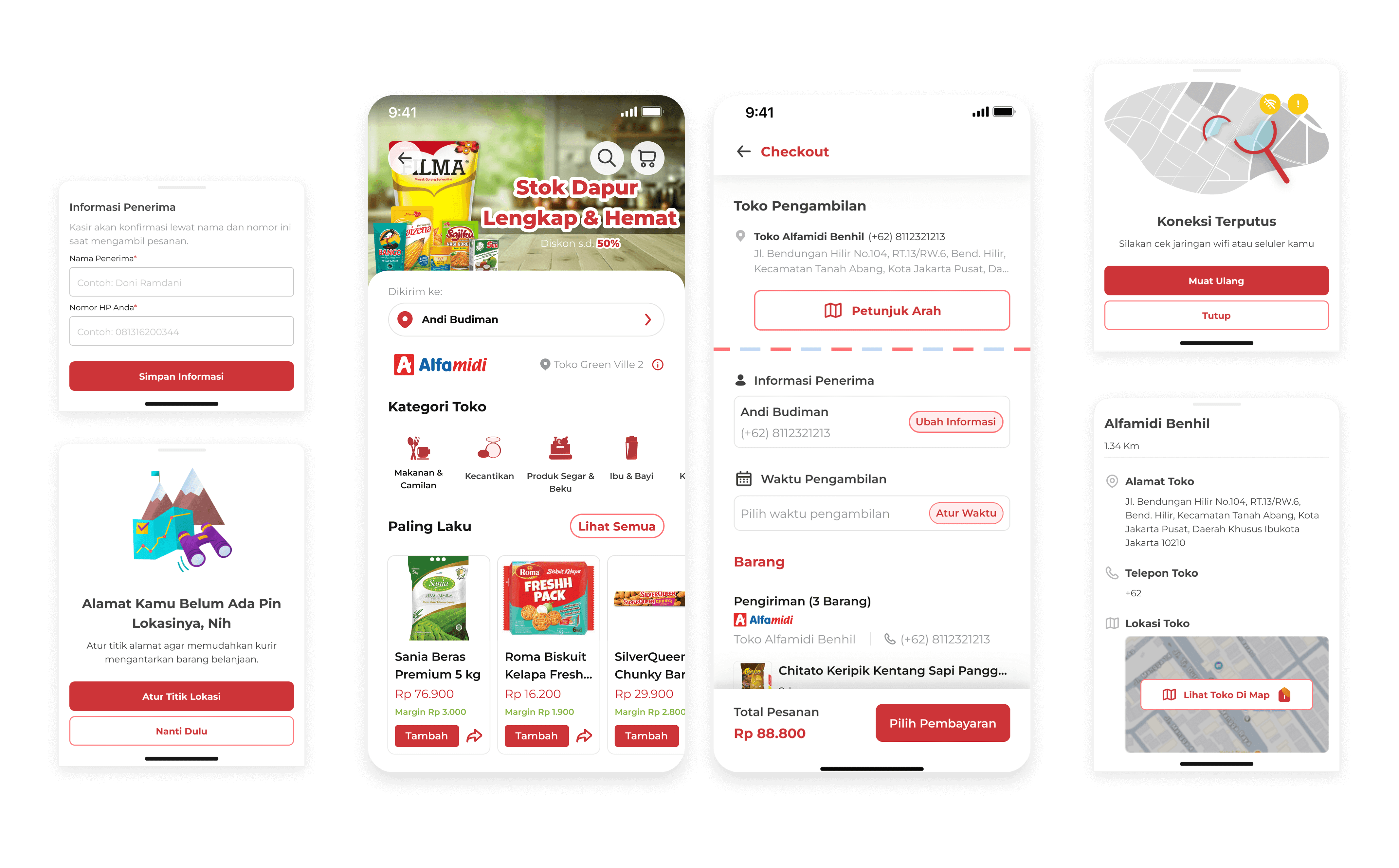
I restart by removing the store section, leaving only with the category as the entry point. Then, I made the address mandatory for users to choose. This approach ensures the system to lock the user’s address and check for product availability near the address’ perimeter.


Why Address Lock?
The address alone cost me almost a month of work because our team and our client went back and forth discussing how the user will choose their delivery method—this also affects how they choose the address. We first explored different layouts regarding the delivery methods—we made it as a button slider for the pickup method and then we made it as a plain ol’ tabbing component. In the end, we choose the latter option because it is more natural to use.
But why do we choose to lock the user’s address exactly? If you remember what I said earlier, we have two things–stock uncertainty and our user behavior of buying products for others. These predicaments make it necessary. We need to check if there are any stores located within the address perimeter, if so we check for the stock quantity, if not we put a feedback message.

Pickup
We decided to use the existing system for the pickup system. I designed a map to visualize how many stores in the area. Users can pick a store by scrolling through a list, search store by parameters (e.g. name, location), or search by using a filter. These entry points give users options on how to select a store to suit their condition.
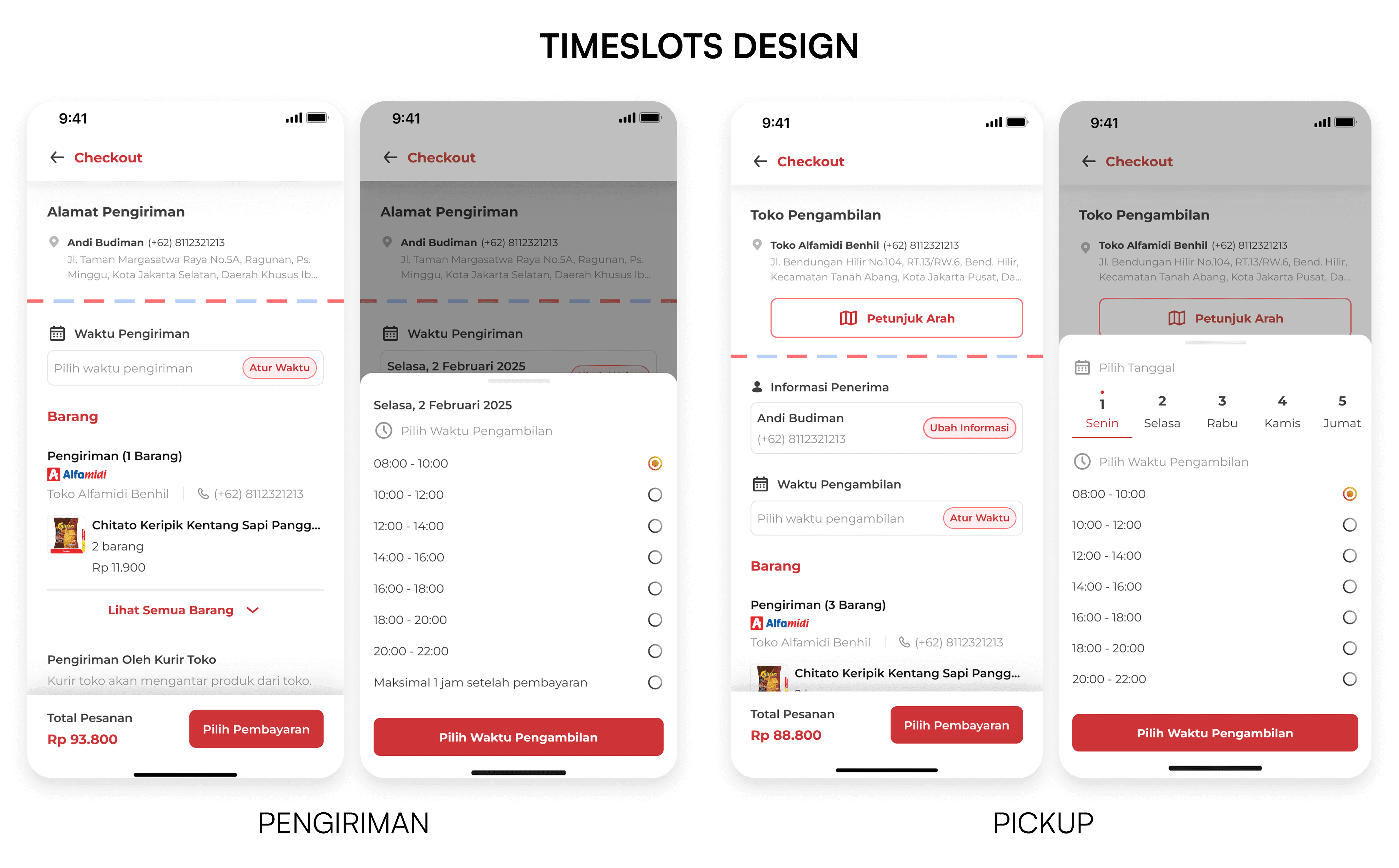
Timeslots
To complete our pickup method journey, we need to add a timeslot for users to pick their order. We allow users to select their preferred day and time for pickup. I decided to use this design layout just because it is versatile. On the user side, it is easy enough to scan which time of day to pick. On our side, we restrict users to a maximum pickup window of 7 days and we can easily modify which time of day is unavailable.




What I have Build and Design
This is where I don't have any constraint from stakeholder and just design for the sake of it.


