Part Of
Mindstores
Ti-Oan Market
Product Design
Q2 2025
Jun 10, 2025
TL;DR
The primary challenge was designing a solution that could support traditional delivery for residents in Dili, Timor Leste who have adequate infrastructure, while also providing a reliable pickup option for rural areas struggling with weak connectivity and inaccurate map data. The team responded by developing a hybrid model: delivery for Dili users and pickup—with code-based collection—at strategic points for rural buyers. The process involved multiple iterations on product cards, cart page layouts, and badges to visually clarify these methods, making the platform accessible even for users with limited digital literacy. Ultimately, the solution was launched successfully and on schedule, integrating both methods with user-friendly cues to ensure clarity and confidence throughout the customer experience.
Introduction
June 26, there was an immediate internal meeting arranged by our head of product. The meeting’s agenda was to discuss our product we built in early 2025, Ti-Oan Market. We talked about the possibility of integrating two methods of delivery: delivery itself and a self-pickup. My client had ambitious plans. They wanted to sell everything from household goods to fresh fried chicken through their web platform. But here’s the great part—we’re not even done with our second development phase so it was a race against time.

The "Aha" Moment
So… This is getting interesting. I knew that our developer is packed with their development phase (not only this project) so I need to act fast. I, alongside our product team, came up with the possible solution of integrating between two methods.
The general logic behind this was if the user is outside of Dili and does not purchase fresh products, they will only have one method, the pick-up method. If the user is in Dili and purchases fresh products, they will have both methods.
Designing Two Paths, One Seamless Experience

I began making another product card, only made for fresh products. I designed three alternatives, the final pick was the option C. The option C picked because it was simple enough to differentiate between products. Then, I created a unique section [click here if you want to read about how i made the unique section] that has a fresh product as if they were in an aisle. After that, I began exploring the cart and pre-checkout page.
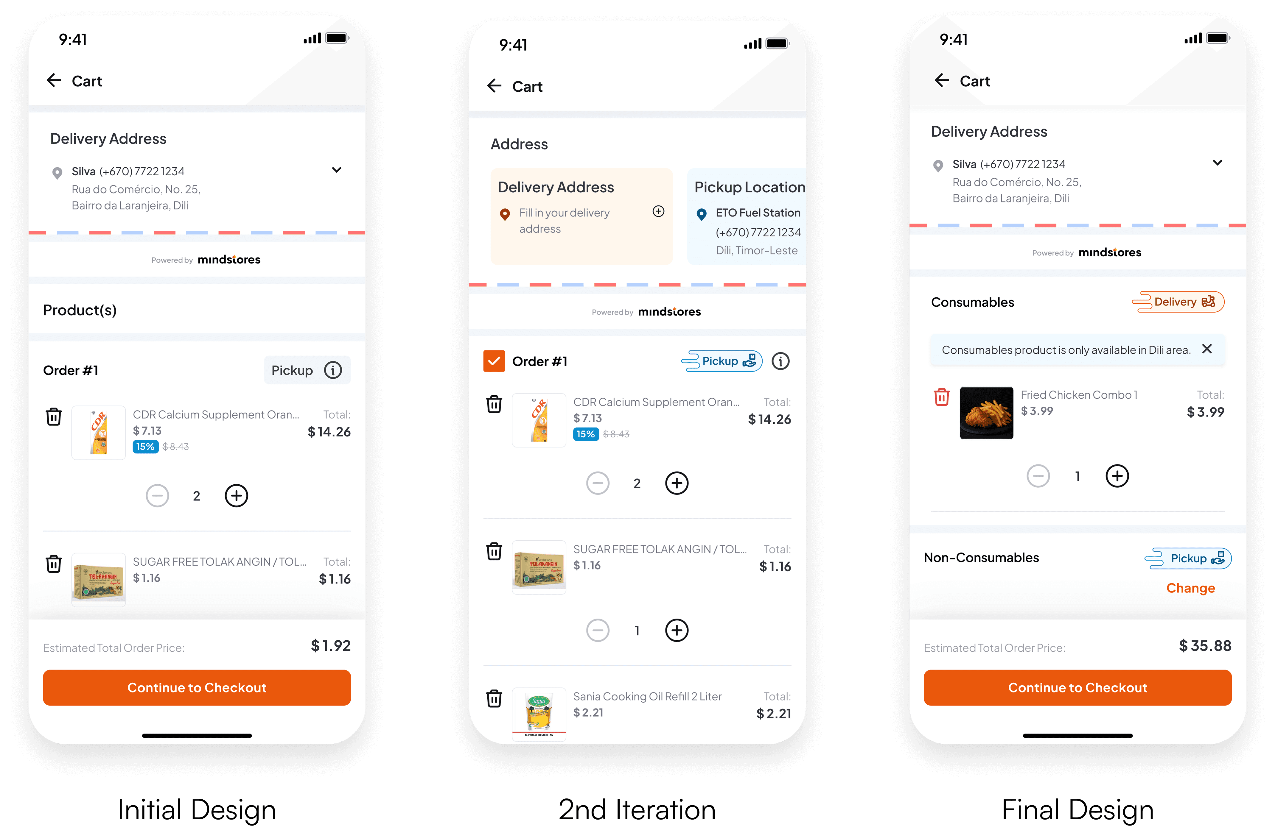
We discuss the difference between the two methods. Is it noticeable? Does the user know what to expect? Is it easy to understand for some users who rarely touch a digital interface?
These questions lingers in my gut to tinker with each of my design decisions. My initial design is not noticeable enough to differentiate the two methods. I only put a “Delivery” or “Pickup” text as the differentiator. We take this approach as the groundwork. The idea is there, but failed to differ between methods.
In the second design we liked the idea of adding color code and icons to the designated method. I create custom badges for each of the methods–orange for Delivery and blue is for Pickup. This adds more dimension to the methods–it guides the user to differentiate the methods by color and expect what would happen next. We loved it, but now onto the next obstacle: Address section. I put emphasis on the address section by color to differentiate the two (like the badges). But this will lead to confusion due to many addresses in one section, even though we color code each of the methods.


The Design Logic Behind the Scenes
To tackle this, on the third design, I put the badges onto the product section, giving clear signs of which product belonged to which type of method. I also put a Title section for the product alongside the badges–”Consumables” for the fresh product/ready to eat & “Non-Consumables” for your typical grocery and staples product. This wasn’t enough because we had to address the address section by placing the Delivery method’s product in the first order, giving a clear connection between the user’s address and the product that uses the delivery method. As for the pickup method, we add a pickup point banner below the title + badge. That will guide the users to know exactly where they should go.
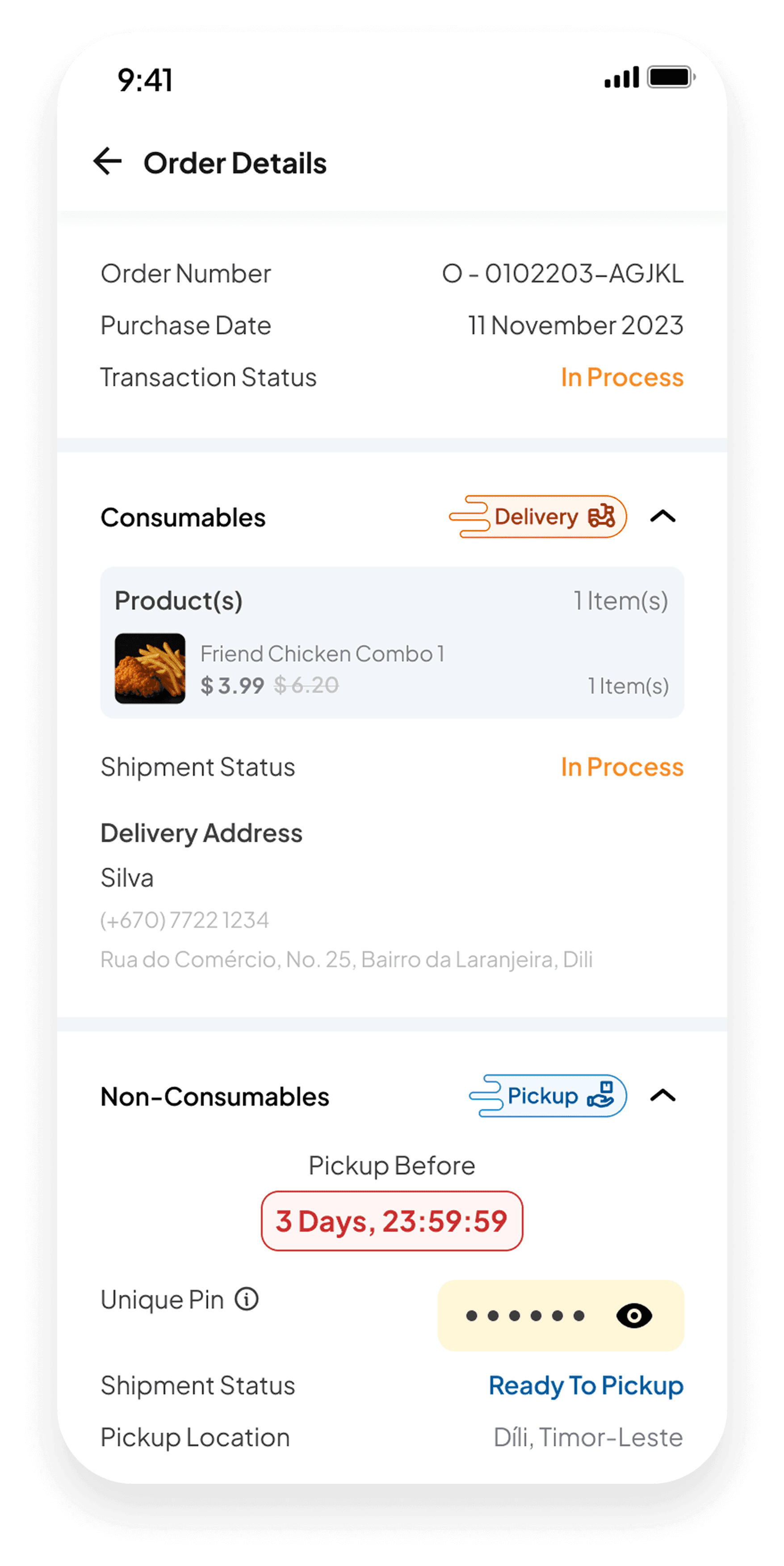

Now we move to the order details. The idea is the same as before. We grouped products that have similar delivery methods. For the Delivery Method, the section will be something similar that we see from other platforms–product list, their address, etc. For the Pickup Methods, we add a PIN code for users to claim their transaction from the storage box. This PIN will be hidden by default. Users will have at least 3 days to claim their product. But what if time is over the limit? Well, the user will be informed to ask the active employee by handing their transaction number. Why? Because the warehouse only has a limited amount of storage boxes, we need to roll out the boxes as fast as the transaction volumes expand.




What I have Build and Design
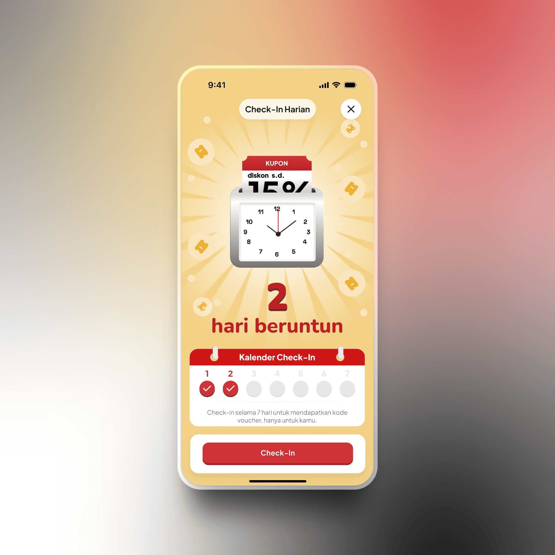
This is where I don't have any constraint from stakeholder and just design for the sake of it.


